
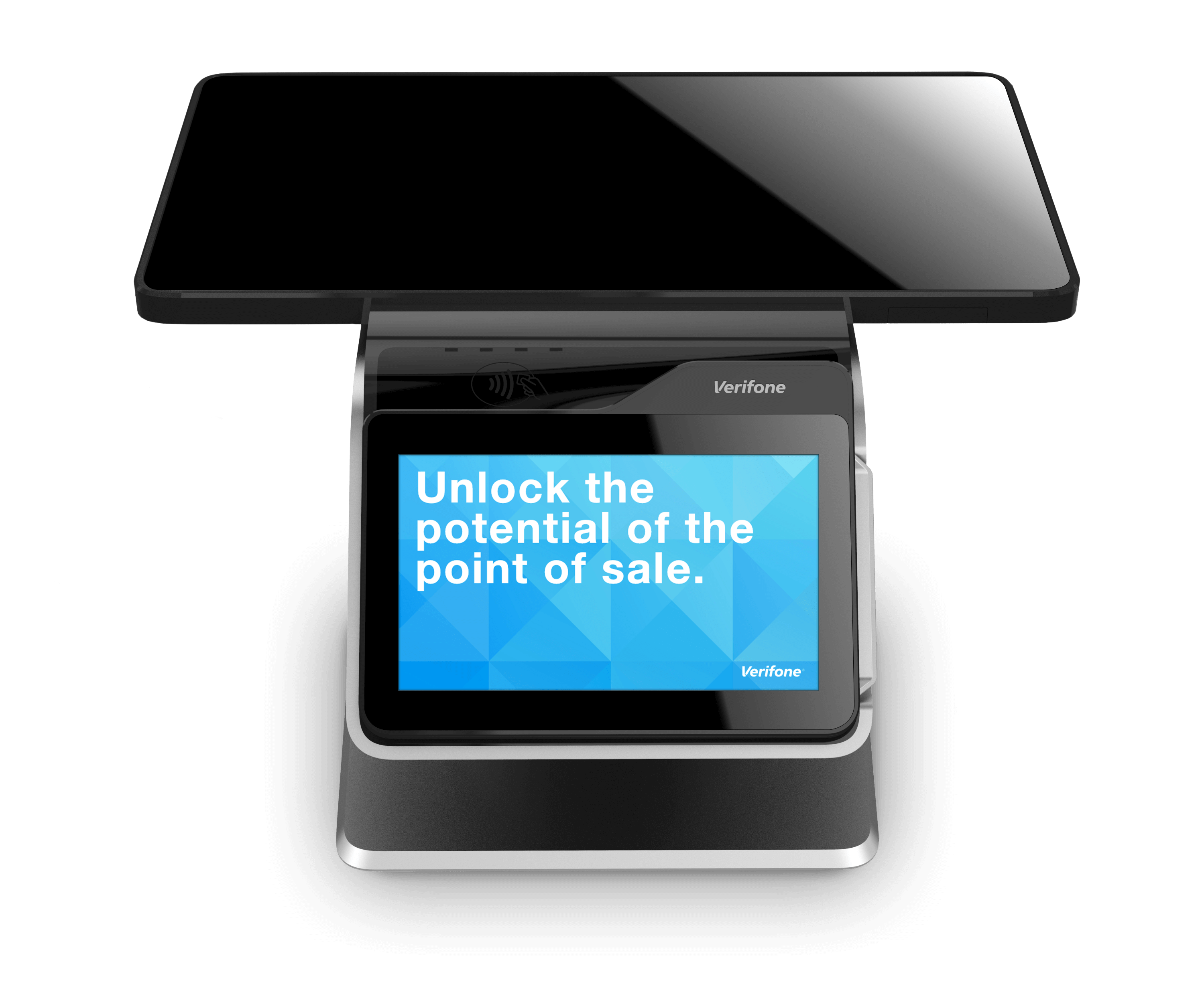
Verifone Payment
Experience
This is some of the work I did for Verifone’s payment experience. Before I redesign the experience, it was very slow and involved many different steps. It was defined by what the region wanted without considering the user’s experience or their needs. My goal was to fix the experience and provide something that was delightful and intuitive, but most importantly was user focused.
Rethinking payment
At it’s core this design wants the user to be successful above all else. That should always be the goal of any product or interface. If the user is presented with something it should be to drive their experience forward always. In order to redesign the payment experience, we had to throw out all the ideas of what payment has to have and only put in what the user needs.
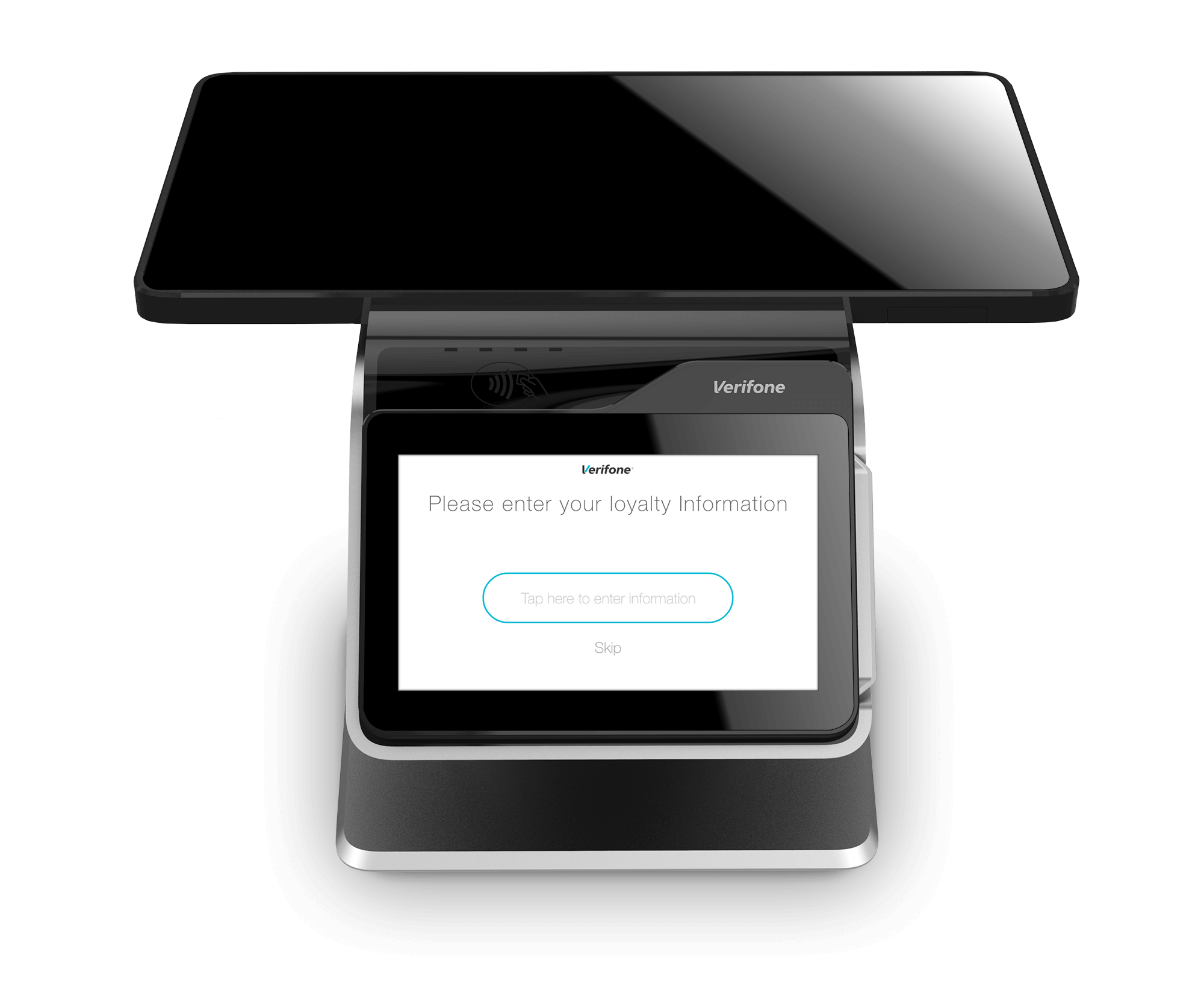
Focal points and hierarchy
I felt it was very important for the user to understand what each screen is trying to communicate to them as quickly as possible. The new design structured each screen to lead the eye to important focal points. This allowed the user to quickly digest the information being presented to them.
In this example, the payment functionally is highlighted in the branding color to catch the user’s eye and quickly communicate what actions can be taken in order to pay.

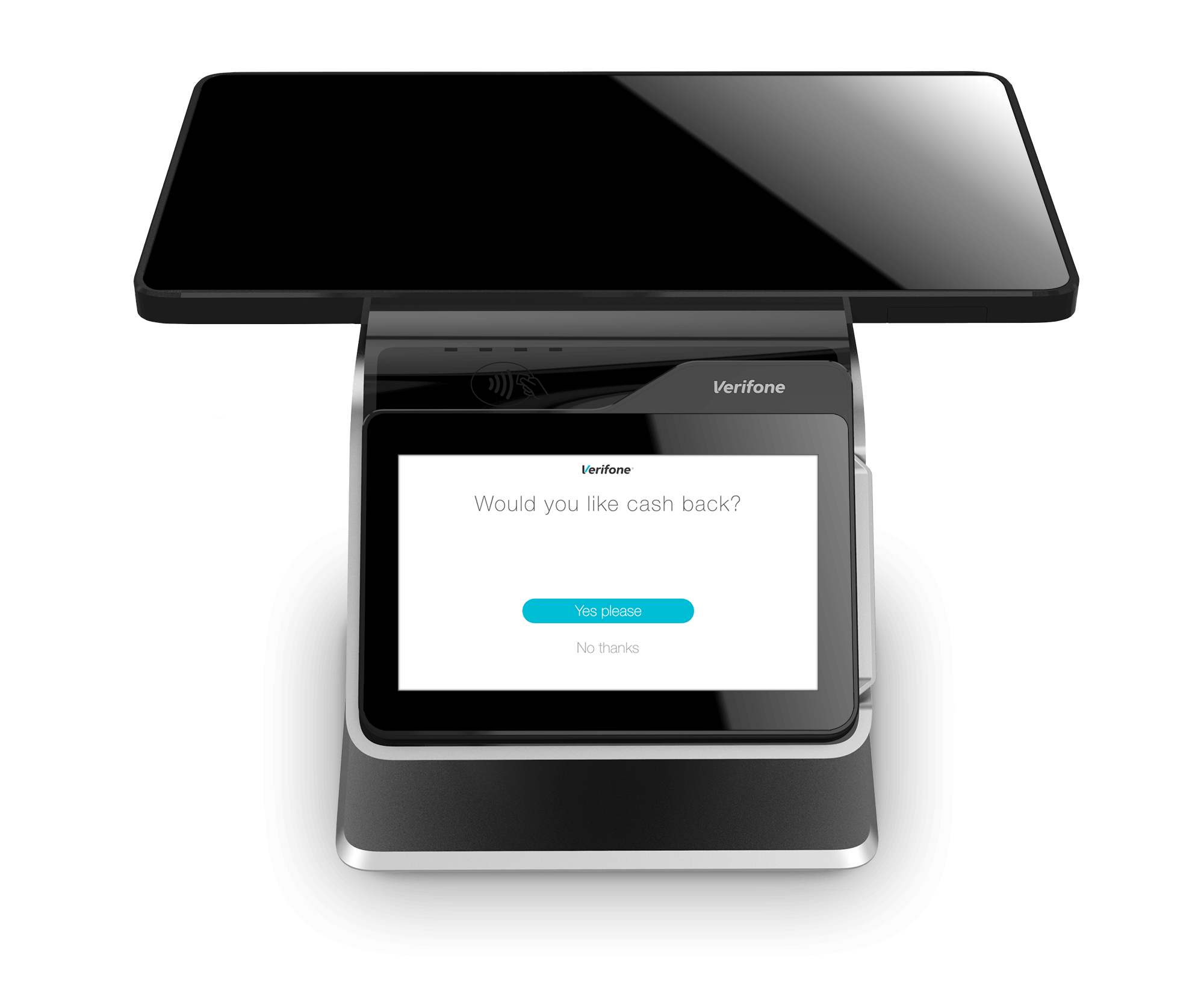
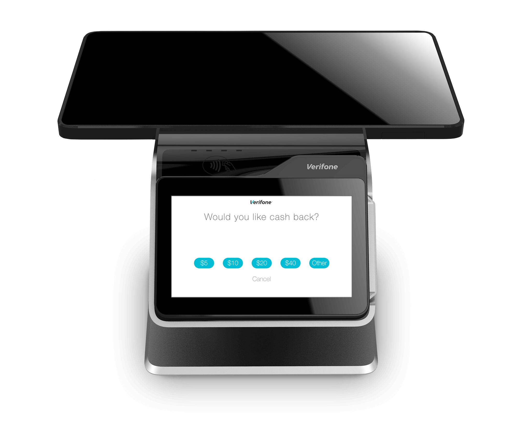
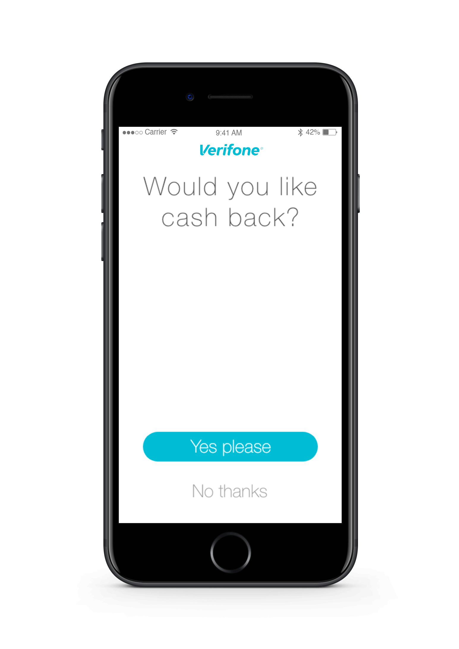
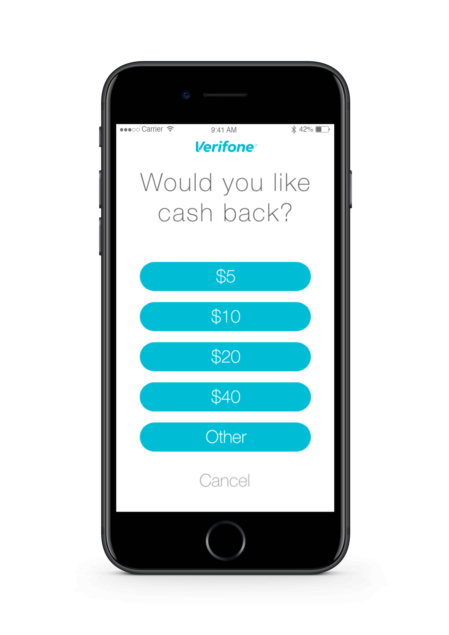
Presenting relevant information
Payments need to be fast and clear. This means that the screen shouldn’t have any extra content that doesn’t add value to the user’s experience. In payment especially, a user must have a clear picture what they are doing on each screen. For the redesign, we only present the user with information when it was actually needed.
In this example, you can see the screen asking the user if they want cash back. Only if they tell the terminal that they want cash back does it present them with the cash options.
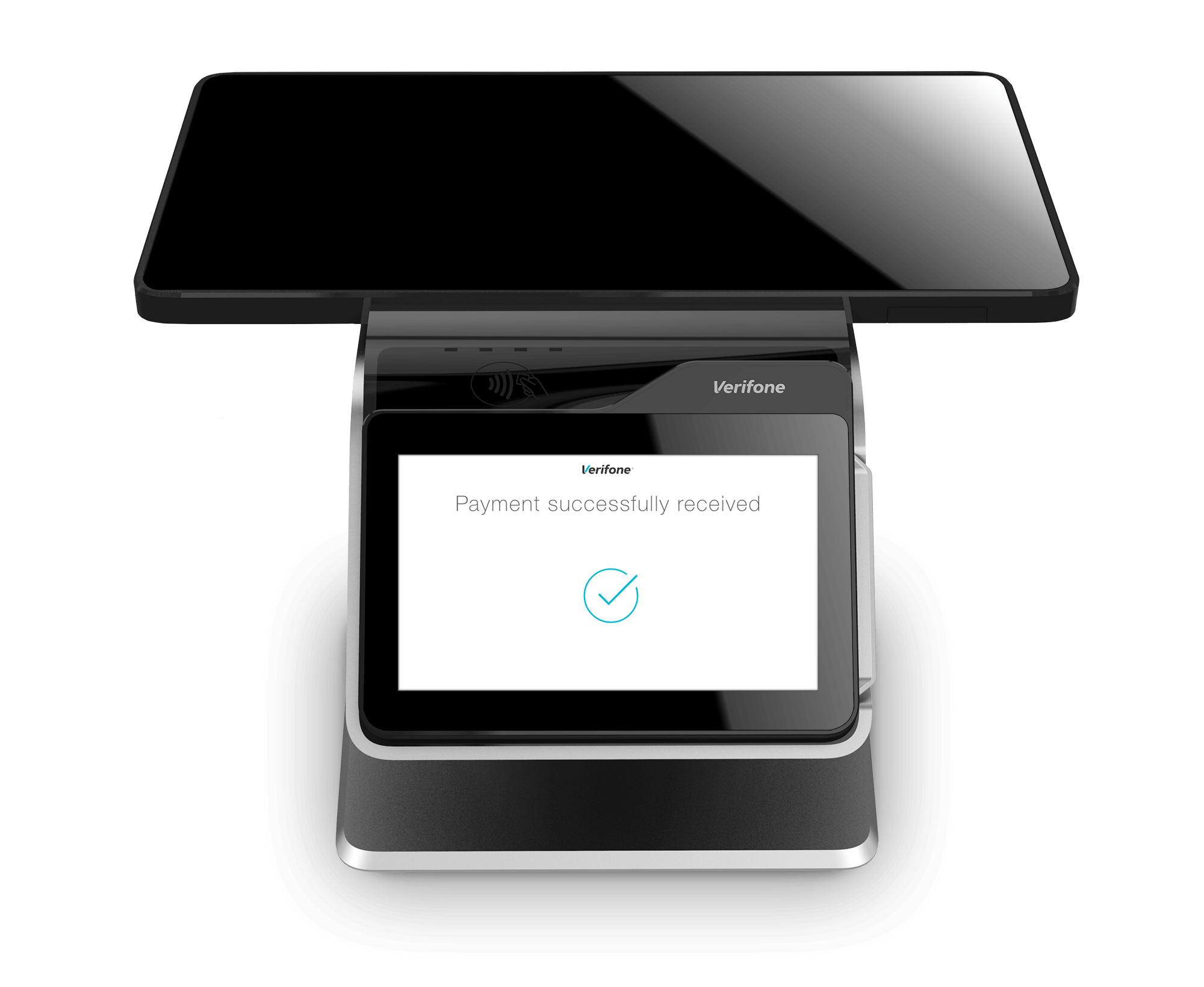
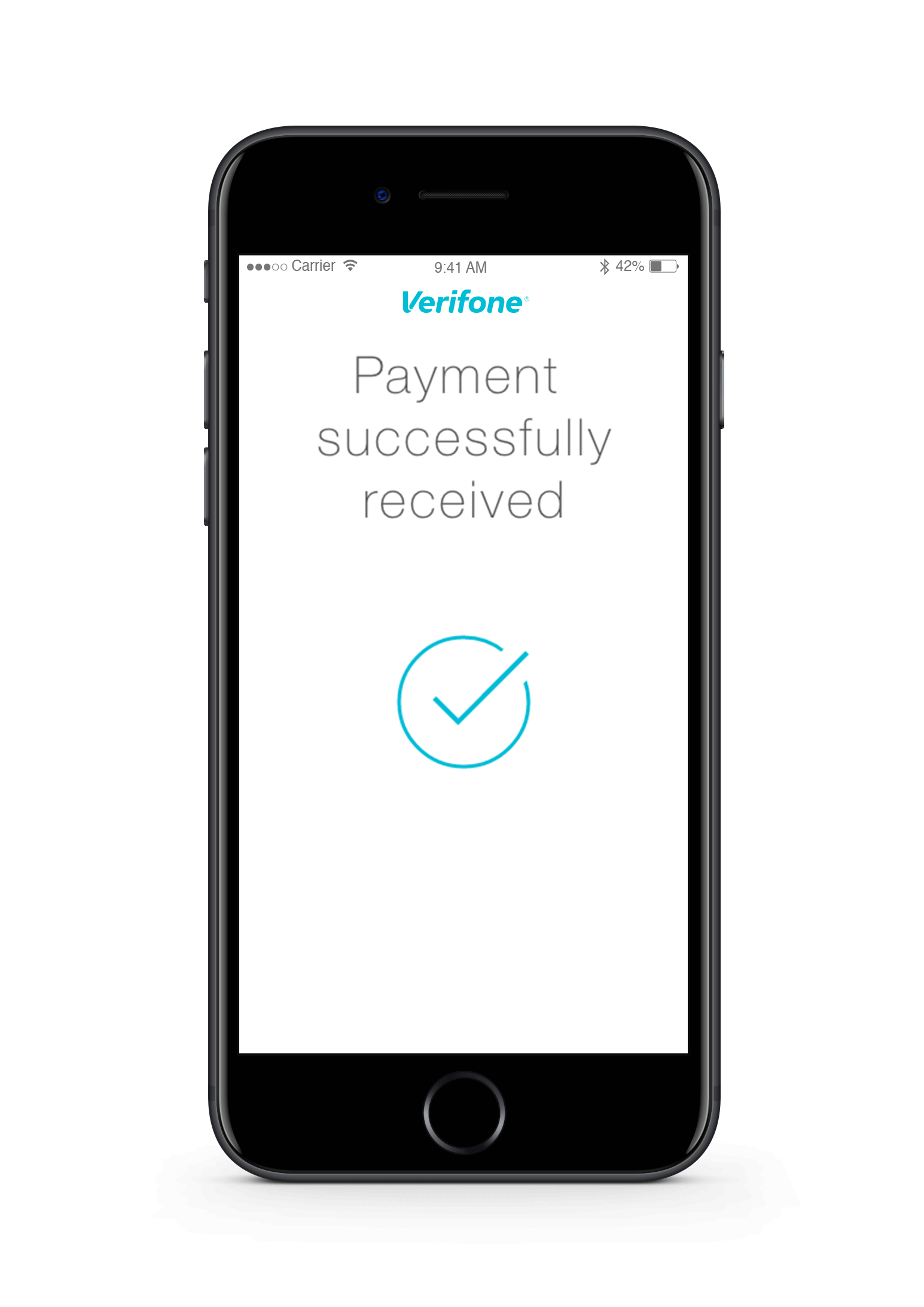
Clear messaging
A lot of times when an action is performed, the user doesn’t always know if it worked. In order to fix this, the new design presents the user with clearer messaging after important actions are performed. This helps the user shift their focus to the next step they might need to take in the flow.
In this example the user is being told that their payment was successful.
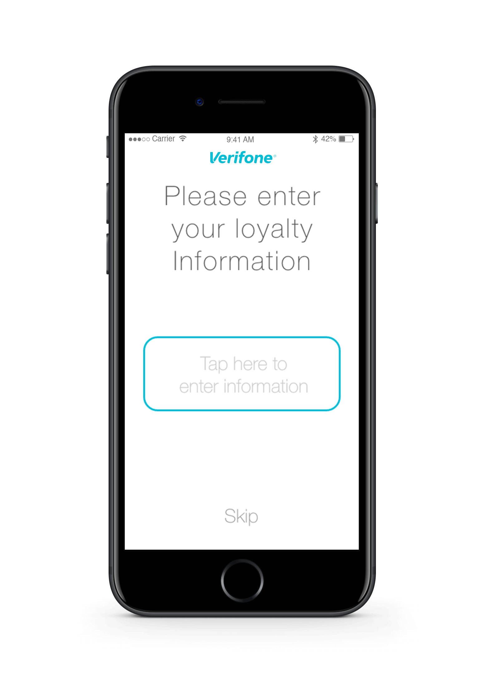
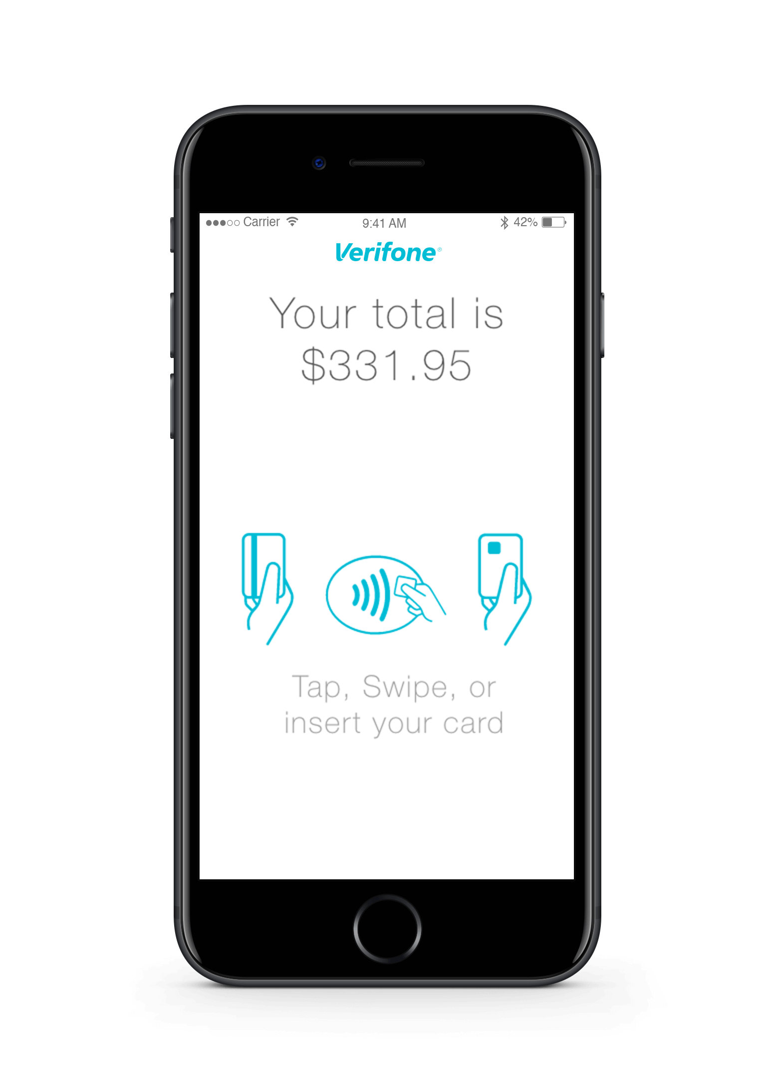
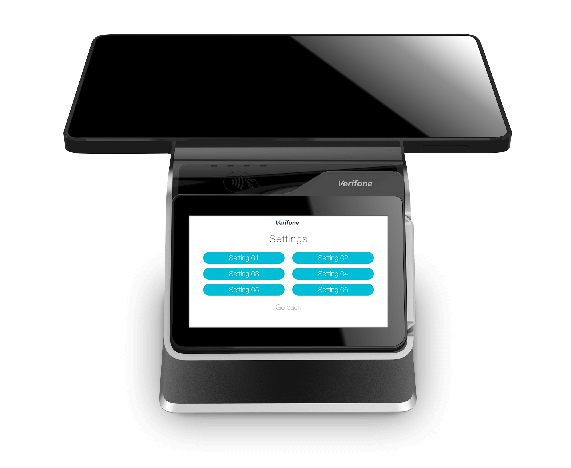
Adapting to form factors
Verifone has hundreds of different terminals out in the wild. This new design was intended to be implemented on all of the newer models. This meant that there needed to be a version for each screen size and resolution. Here you can see how some of the different screens went from a POS system to a mPOS scenario like using a iPhone.
Boot animations
One of the more fun aspects of the redesign was the animations. I couldn’t do very much animation because they are very expensive for the system. One that was explored extensively was the boot animation. This is one of the explorations I felt worked very well.